17.752 30-03-2011 16:24:12
Re: Persona (PSP). (19 respuestas, enviadas el Hablemos de juegos)
17.753 30-03-2011 16:22:20
Re: Final Fantasy IV: the After Years. (13 respuestas, enviadas el Hablemos de juegos)
Complete Collection, 'play movie':
17.754 30-03-2011 16:13:18
Tema: Grand Knights History: Vanillaware vuelve. (43 respuestas, enviadas el Hablemos de juegos)
...Aunque lo haga a una maldita maquinita portátil. Se ha presentado en Famitsu, junto a una entrevista al equipo, que revela que es su primer RPG de combates por turnos, por si hubiera que seguir lamentando cosas. Publica Marvelous y se espera el próximo verano en PSP [bah...]:

17.755 30-03-2011 16:00:25
Tema: Gloria Union (PSP). (5 respuestas, enviadas el Hablemos de juegos)
Nueva entrega de la 'Union series' de Sting anunciada en Famitsu:
Nuevo ilustrador y edición de la mano de Atlus, en Junio.
17.756 30-03-2011 15:55:19
Re: Ore no Shikabane wo Koete Yuke 2 podría ser una realidad. (21 respuestas, enviadas el Hablemos de juegos)
Presentado finalmente en Famitsu. 'Remake' para PSP con nuevas escenas y conservando el estilo visual original, de manos del mismo equipo. Las fotos no es que dejen ver demasiado.
17.757 28-03-2011 20:31:59
Re: Super Robot Taisen Z (PS2). (30 respuestas, enviadas el Hablemos de juegos)
17.758 28-03-2011 20:30:31
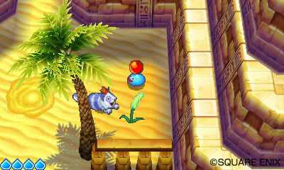
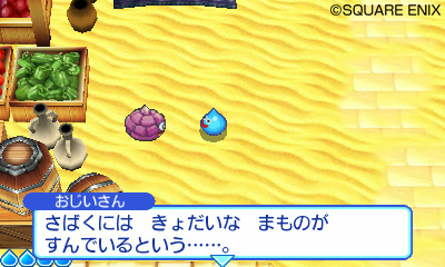
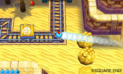
Re: Slime Mori-Mori Dragon Quest 3 (3DS). (6 respuestas, enviadas el Hablemos de juegos)
17.759 26-03-2011 16:49:49
Re: Eiyuu Densetsu: Zero no Kiseki (PSP). (28 respuestas, enviadas el Hablemos de juegos)
Mientras esperamos que se muestre algo con sustancia del recientemente anunciado Eiyuu Densetsu: Ao no Kiseki, secuela para PSP de Zero no Kiseki, nos encontramos con que éste va a ver nacer un 'remake' en PC para el mercado chino de Windows:


http://blog.sina.com.cn/s/blog_6c91083b0100qqej.html
http://item.taobao.com/item.htm?id=9717226677
No parece que Falcom tenga nada que ver con el desarrollo, y de hecho, huele a producción china, pero, oye...
Enlace: http://www.neogaf.com/forum/showpost.ph … ostcount=1
17.760 26-03-2011 16:41:35
Re: Moon Diver. (12 respuestas, enviadas el Hablemos de juegos)
17.761 25-03-2011 15:53:54
Re: Los proyectos de Cave. (78 respuestas, enviadas el Hablemos de juegos)
La última entrada del 'blog' de Asada para Cave viene a anunciar que Akai Katana Shin será el último juego de disparo de la compañía en este año. No especifica si es en el ámbito de XB360, pero es de suponer.
Nin-Nin Jump está a punto de finalizar el proceso de calificación por edades y se espera anunciar su salida muy pronto.
La próxima Famitsu X-Box 360 llevará una columna escrita por Asada sobre Instant Brain.

17.762 25-03-2011 13:47:17
Tema: Down Town Nekketsu Monogatari 2 (WII). (1 respuestas, enviadas el Hablemos de juegos)
Anunciado oficialmente para Wii Ware, siguiendo al Down Town Nekketsu Dodge Ball, del que se acaba de publicar un vídeo promocional:
http://www.4gamer.net/games/130/G013011/20110325030/
Viene de la mano de Miracle Kids, que reúne a algunos de los autores originales de los Kunio-kun de Technos Japan y están dispuestos a no dejar morir a la saga.
17.763 25-03-2011 13:29:31
Re: Moon Diver. (12 respuestas, enviadas el Hablemos de juegos)
'Demo' disponible el 29 de Marzo en la PS Store:
17.764 25-03-2011 12:05:12
Re: Mushihime-sama: Bug Panic. (2 respuestas, enviadas el Hablemos de juegos)
Modo 'versus' para la actualización del juego que sale mañana:
17.765 25-03-2011 11:50:01
Re: Seisou Kouki Strania (ARC). (22 respuestas, enviadas el Hablemos de juegos)
Vídeo sobre la mecánica en el frontal:
http://www.youtube.com/watch?v=dwjRzpyXiVc
Y vídeo de la fase 3, que nos pasó desapercibido:
http://www.youtube.com/watch?v=SsU8ZarCYcc
Enlaces: GN 1.0.
17.766 25-03-2011 11:43:28
Re: Dungeon & Fighter prepara su desembarco en Japón. (12 respuestas, enviadas el Hablemos de juegos)
Dungeon Fighter Online Brawls On To Xbox Live Arcade
17.767 25-03-2011 11:40:47
Re: Nintendo Wii. (164 respuestas, enviadas el Hablemos de juegos)
VC: Last Resort y Chrono Trigger, en Abril. Marzo ha visto la adaptación de Final Fantasy VI y Febrero vio la de KOF '96:
17.768 24-03-2011 00:02:17
Re: Megami Ibunroku Devil Survivor (DS). (20 respuestas, enviadas el Hablemos de juegos)
17.769 22-03-2011 15:56:30
Re: Chaos Code: Nuevo. Juego. De Lucha. (38 respuestas, enviadas el Hablemos de juegos)
La tienda Tops dice que en Agosto:
http://www.tops-game.jp/shinsaku.htm#chaos_code
Enlace: http://www.am-net.jp/
17.770 22-03-2011 15:52:01
Re: Mamoru-kun ha Norowarete Shimatta! (27 respuestas, enviadas el Hablemos de juegos)
17.771 22-03-2011 15:51:20
Re: Final Fantasy IV: the After Years. (13 respuestas, enviadas el Hablemos de juegos)
17.772 21-03-2011 21:36:16
Re: Wizardry: Torawareshi Damashii no Meikyuu (PS3). (8 respuestas, enviadas el Hablemos de juegos)
17.773 21-03-2011 21:29:19
Re: Nos queda el doujin. (4.151 respuestas, enviadas el Hablemos de juegos)
Jamestown (WIN).

http://www.finalformgames.com/uncategor … e-mention/
Nótese que las capturas a su resolución nativa son obra mía. Los amantes del "pixel" estos han roto cualquier estándar conocido y su intención, imagino, es que cada uno escale como pueda. Su propuesta es ésta:

Al menos, la banda sonora tiene su gracia.
Enlaces: http://www.siliconera.com/2011/03/20/ja … t-on-mars/
17.774 21-03-2011 21:10:54
Tema: Slime Mori-Mori Dragon Quest 3 (3DS). (6 respuestas, enviadas el Hablemos de juegos)
Porque sigue teniendo algún 'sprite'...:

Enlace: Re: Zaregoto.
17.775 12-03-2011 18:57:13
Re: Win X68k High Speed v0.95 full screen patch and low res display. (1 respuestas, enviadas el English talk)
The game [Valusa no Fukushuu] has a 'CRT Mode' option in the configuration menu, but I don't know enough about the hardware to know what exactly its doing. I suggest you look into it, I'm rather interested myself to know what it does, and its rare you ever see such an option in a game.
The game also switches into a high resolution mode when there is a cutscene.
It's just the usual 15/31-kHz switch. Most, if not all, X68 low-res games run in a default 'pixel-quadrupled' hi-res mode, which is quite ugly and unnatural, if may I add. Some, like Valusa, have the option to use the system's true low-res mode for a proper display, given that the monitor was tri-sync-capable (some games have the option a bit hidden if you don't have the manual, actually).
The tricky part here is that the X68 almost never used 480 lines for the hi-res display like every other platform did, but 512 lines instead, whereas it did use the more standard "240p" modes for low-res display. So the low-res games were normally rendered at 256 lines [256 x 2 = 512], but when switching to 15 kHz, only 240 were displayed by losing 16 lines in the process (with Sol-Feace it's quite evident, since you'll miss the lives-left display).
Unmodded X68 emulators for WIN do two particular things to keep in mind:
- They use the 800 x 600 mode for full screen, given that they need to display 512 lines and 640 x 480 wouldn't suffice (there's not a mode of 512 lines on standard WIN hardware, as you'll know). Therefore, you get either, windowed or upscaled visuals on full-screen display with them.
- They can ignore the double scanning the X68 did for the 31-kHz modes in low-res games, so instead of pixel-quadrupling the picture like the system did, they keep the original frame buffer intact, hence the graphics are displayed with no artifacts at their design resolution. Of course they'll do this in a window --much like they do it when you run a game at 15-kHz modes-- usually of 256 x 256 pixels in this case.
Here's where Calamity's patch comes in handy, of course. It forces a full-screen mode of 240, 256 or 512 lines for those of us with 'low-res' video cards, hence even the originally 'pixel-quadrupled games' with no "240p" option are displayed at their native resolution.