1

Tema: Eurostyle.

http://postback.geedorah.com/foros/view … 773#p12773

Macaw escribió:

I'd say that boss is cooler than whats in the majority of Japanese platformers, especially in the last 15 years.

And Neogeodev team advertising this as a 'eurostyle platformer' is completely idiotic.  Apart from the fact that such a title sounds stupid, Turrican was a complete attempt to be as japanese in its design as possible. If anything, a 'eurostyle' platformer would be more along the lines of stuff like Myth and Lionheart, where character animation was emphasized over tight controls, in a prince of persia kinda way (and of course having to hold down buttons then press different directions to attack)

I was making fun of the word, of course. If we're talking about visuals, I think it's silly stating there ever was a style proper of the European countries as the term implies (something which you only could expect from Americans, by the way; how come there isn't an Ameristyle?) but it's sure nevertheless the style of Turrican and friends is different to the Japanese one(s), since you can clearly say that those couldn't have been made in Japan. And yeah, even if it tried to be as Japanese as possible (mostly mechanics-wise, though), which it indeed did.

The major thing which separates Japanese and non-Japanese visuals in bitmap games is polishment and coherence in the end, if you ask me. Japanese were (are) better and more educated artists and also put more effort, hence you don't find mistaken proportions and colors, dumb motifs and lazy decisions in Japanese pieces like you do in Western games. That's why you won't find anybody saying that Nieborg efforts are 'eurostyle', and only some little things (usually the worst ones) unveil them as non-Japanese visuals.

This boss:

http://www.gun-lord.com/img/bossBIG.png

...while, as I said, somewhat impressive and not entirely bad (I agree it's by far the best they've shown), lacks the beauty and refinement of samples like these:
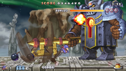
http://news.dengeki.com/elem/000/000/123/123127/c20081120_prinny_15_cs1w1_480x272.jpg

http://dsmedia.ign.com/ds/image/article/918/918073/castlevania-order-of-ecclesia-20081009095021467_640w.jpg http://dsmedia.ign.com/ds/image/article/642/642438/castlevania-dawn-of-sorrow-20050817021120930.jpg

http://www.nintendo.co.jp/n10/e3_2006/ds/06_magical/img/04.jpg http://dsmedia.ign.com/ds/image/article/932/932475/elebits-the-adventures-of-kai-and-zero-20081120034539098_640w.jpg


http://dora2008.sega.jp/img/action/topic_bg0120.jpg

They all less than ten-years-old.
2

Re: Eurostyle.

Well you see, I find the Gun Lord boss just as impressive if not more so than your examples. Thematic settings and even skill of the artists is all subjective here, so I'm not sure how much can be gained from discussing this.

The Gun Lord boss actually reminds me of the Toaplan style somewhat.

3 (editado por icycalm 12-05-2011 16:35:48)

Re: Eurostyle.

Everything is subjective so Recap might as well close the forum down since Macaw is "not sure how much can be gained from discussing anything" lol.

Or did you just mean that you felt offended that Recap attacked your taste and instead of trying to offer arguments to the contrary you would feel more comfortable by undermining the authority of his taste by labeling it as "subjective" and dropping the discussion?

For the record, I think that GunLord boss looks perfectly fine. Not great, or special in any way, but I would have easily taken it for a Japanese effort if not told otherwise. The only things bad about that screenshot are the sprite, the bonus items and the platform. The boss, background and weapon effects are just fine as far as I am concerned. So I concur with Recap that what Westerners often fail to get is cohesion between the various visual elements -- as if different people worked on them without bothering to show each other what they were doing. And the same of course holds true for 3D efforts. Take a game like Otogi, for example, where the fucking menu screens are some of the most visually impressive things I've ever seen on a computer monitor, and the entire game's style flows like water. I can't imaging Westerners ever getting anywhere near that level of coherence in a hundred years. Except with something as simple and plain as a minimalist amateur game -- in which case even I could do it.

4

Re: Eurostyle.

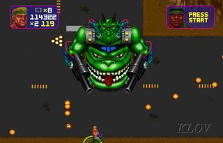
That boss could never pass as Japan-made in my eyes for two factors:

- The face. It's just too ugly for being Japanese. A Japanese artist would say that even ugly alien monsters require stylization. This is what it reminds me of:

http://www.arcade-museum.com/images/110/1106551395.jpg


- The hand. You just can't believe that hand is triggering the weapon as it is captured. That never happens in Japanese pieces.


The rest is fine.

5

Re: Eurostyle.

icycalm escribió:

Everything is subjective so Recap might as well close the forum down since Macaw is "not sure how much can be gained from discussing anything" lol.

Or did you just mean that you felt offended that Recap attacked your taste and instead of trying to offer arguments to the contrary you would feel more comfortable by undermining the authority of his taste by labeling it as "subjective" and dropping the discussion?

Discussing this, not discussing anything. Frankly I couldn't be bothered getting into a discussion about the fact that most of recaps screenshots show a more lighthearted art style, and most people wouldn't really see why they are more impressive than GunLord. If anything they just show the more superior backgrounds and cohesion, but we already all agreed on the fact that GunLord was looking a bit fucked in that regard. My original argument was only about the boss sprite.

And comparing the GunLord stuff with Total Carnage? I wouldn't take it that far.

Lets compare it with a better example of an ugly alien face:

http://www.neo-geo.com/reviews/neo-reviews/cyberlip/cyberlip1.gif

The stylization of the face is much cooler in the cyber-lip example, but regardless the GunLord boss is much more impressive to me.

6 (editado por JoshF 13-05-2011 00:55:01)

Re: Eurostyle.

The face on that Gun-Lord boss is made up of bad forms that aren't pleasant to look at.  The thin jaw, the eye placement which suggests they are as close as nostrils, and nostrils that appear to be on the cheekbones are the offenders in my eyes.  Really, it's just a second rate version of this design:

http://www.ackbar.org/images/ackbar.jpg

7

Re: Eurostyle.

To properly settle my point -- I wasn't discussing 'impressiveness', but 'art quality', i. e. 'consistency' and 'beauty'. And yeah -- boss sprites only.

8

Re: Eurostyle.

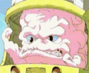
http://assets.sbnation.com/assets/208224/KRANG.gif