Good job of capturing Disney/Fleischer style. They know the right games in the genre to emulate too, and seem to also know their problems. I'm sure speedrunners would complain about the randomization but too bad for them.
2 17-12-2013 04:04:11
Re: Candle. (4 respuestas, enviadas el Hablemos de juegos)
The high resolution gives the visuals some appeal, but the character designs are repulsive and the environments too drab. You can tell the designers are European and unfortunately informed artistically by all those old Amiga games with dull, gnarled forests. Nanatsu Kaze no Shima Monogatari accomplished this style much better 15 years ago, much less Vanillaware's more recent works.
3 30-11-2013 04:37:31
Re: Mighty No. 9. Inafune again (4 respuestas, enviadas el Hablemos de juegos)
Here's some early footage of a cartoon character moving around in a Doom environment. I guess they haven't learned from Bionic Commando Rearmed.
4 24-11-2013 02:24:58
Re: Guilty Gear Xrd ~Sign~ (ARC) (66 respuestas, enviadas el Hablemos de juegos)
I do think the bold outlines are a conscious stylistic choice. It wouldn't be hard to change it if they wanted to. The results are comparable to Daemon Bride, if not better.
Another benefit I forgot to add is that the "frames" will stay on-model. If you look at some of the old GGX animations closely the anatomy would often shift in strange ways. Capcom could exploit the deformation aspect of 2D animation magnificently (e.g. Wolverine in XM:CotA, which is still the best representation of the character) but the Arc System Works staff was never as talented and it just came across as drawing errors. These models are a marked step up from the GGX sprites, at least. Also, I wouldn't call slight anti-aliasing "blurriness", and dot graphics use a similar technique to soften edges.
Maybe I would enjoy BlazBlue or Persona 4, but I have heard many times that they essentially use a watered-down version of the Guilty Gear X system. I really hope that they don't do the same thing with this game.
5 23-11-2013 09:58:05
Re: Guilty Gear Xrd ~Sign~ (ARC) (66 respuestas, enviadas el Hablemos de juegos)
BlazBlue looks great for dot art. This game looks great for 3D renders. Since it's 3D, it has some added benefits. The models can be used for cinematics, you can zoom in and out without pixelization, alternate costumes could be easily produced, and you would have continuity with asymetric designs (e.g. Sagat's eyepatch and scar would not flip). All of these issues could be solved with dot art if you had a Disney-sized animation staff or didn't need to worry about return on investment, but Arc System Works isn't anywhere close to having those kinds of resources.
It's my hope that SNK and Capcom would start looking to this technology to introduce there classic styles into modern games. I won't get 1% of the games I wish would be made, so I will be grateful for this one. I'm also glad I'll soon be able to play a side-view fighting game that is more advanced than Street Fighter that doesn't predominantly feature emaciated little girls, and presumably won't have excessive combos that interrupt the fighting with Beatmania minigames, like MVC3. It's definitely one of my most anticipated games now.
6 19-11-2013 04:05:18
Re: Guilty Gear Xrd ~Sign~ (ARC) (66 respuestas, enviadas el Hablemos de juegos)
I have to say that I think this looks great. It's the best cel-shading I've seen in a game and hopefully we'll see more of it, with improvements (Hard Corps: Uprising 2 would be nice). If they were trying to recreate Metal Slug visuals in 3D I would probably take issue with the rendering but for anime-style it's sufficient.
7 03-06-2013 08:37:17
Re: Guilty Gear Xrd ~Sign~ (ARC) (66 respuestas, enviadas el Hablemos de juegos)
I couldn't tell they were 3D models until the camera rotated. What I don't get is why they wouldn't try for Third Strike-quality animation if they're not manually drawing frames.
8 29-10-2011 04:49:08
Re: Nos queda el doujin. (4.128 respuestas, enviadas el Hablemos de juegos)
They really nailed the Amiga look with Gun Lord. Random art direction like waterfalls coming from the sky and gargoyles on mountains, and the illustrator and sprite designers look like they never consulted with each other.
9 13-06-2011 02:10:14
Re: Nos queda el doujin. (4.128 respuestas, enviadas el Hablemos de juegos)
The Soul of Dracula (WIN): http://www.youtube.com/watch?v=VPnrkbak6v8
10 02-06-2011 22:36:29
Re: Rayman Origins (8 respuestas, enviadas el English talk)
The silhouette fad in these games is old. How pathetic that these people think no style is supreme style. It just highlights how hideous the forms of these characters are.
David Kong Country Origins Returns: Betrayal 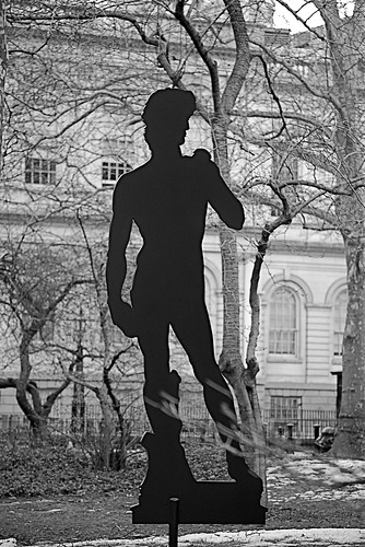
11 27-05-2011 17:39:44
Tema: New CRT Filters (4 respuestas, enviadas el English talk)
http://www.neogaf.com/forum/showpost.ph … tcount=434
http://filthypants.blogspot.com/2011/05 … dated.html
This is the latest and greatest version of the collaborative CRT shader. The screen curvature is user-definable, based on changing a single value in the helpfully commented shader code. As you can see, it looks totally amazing. It also runs a lot faster than it used to, so give it a shot even if your machine couldn't handle it before.
12 13-05-2011 01:52:34
Re: Eurostyle. (7 respuestas, enviadas el English talk)
The face on that Gun-Lord boss is made up of bad forms that aren't pleasant to look at. The thin jaw, the eye placement which suggests they are as close as nostrils, and nostrils that appear to be on the cheekbones are the offenders in my eyes. Really, it's just a second rate version of this design:

13 03-04-2011 19:09:19
Re: Grand Knights History: Vanillaware vuelve. (43 respuestas, enviadas el Hablemos de juegos)
Someone with good taste in this area is someone who can identify the nuances in technique that create a richer, more pleasant image for the eyes to behold. It's what lets Recap distinguish Vanillaware character design from a repulsive, toothless sack of dead flesh that a toddler could nearly replicate with a couple of crayons.
14 12-03-2011 19:04:13
Re: 'Oscuro' es poco decir. (434 respuestas, enviadas el Hablemos de juegos)
Here's a system tutorial for Double Dragon for Zeebo: http://www.youtube.com/watch?v=_N_cMoceAss
Here's a video from the iPhone version which seems to suggest an "updated" system: http://www.youtube.com/watch?v=sgmUt3lf1Fo
While new sprites are refreshing, honestly there have been better looking/playing OpenBoR games. Also twenty-five years later you'd think they'd learn a lesson from Final Fight's scenario design (hint: have more than the same short-range enemy dressed up in a different sprite.)
15 28-02-2011 00:09:44
Re: Hard Corps: Uprising (29 respuestas, enviadas el Hablemos de juegos)
Yeah that's better but I don't think you can compare a side-view action game to a versus fighting game where the environments are not interactive and only take up 2 screens at most. I think the reason we're getting a lot of fighting games is, sorry to say, because they're easier to make. They don't want to put in the time for things like scene development and stage designs. I'm glad Arc Systems actually tried to make it work.
16 27-02-2011 20:48:40
Re: Hard Corps: Uprising (29 respuestas, enviadas el Hablemos de juegos)
"Polished" is a weird way to describe Super Contra's laggy aiming. The FC version is great though (lol.) Spririts is great but a bit too easy. Uprising would be an arcade game, if not for the aforementioned Donkey Kong Country shenanigans.
What I mean by "2D anime-style backgrounds" is that the textures have a painted quality.
I'm thinking of re-writing most of my old reviews and Metal Slug will probably be the first. I'd like to make it around 20-30 paragraphs and talk about every aspect of it as in-depth as possible, including the visuals which I stupidly ignored in the original. I also left out much of the mechanical detail that make it (along with some of it's sequels) one of the best action shooters ever made. I think I also included a dig at the later sequels which was also stupid, since they look and play better than any action shooter not called Metal Slug 1-3.
17 27-02-2011 08:34:53
Re: Hard Corps: Uprising (29 respuestas, enviadas el Hablemos de juegos)
I think they did a good job making the 3D backgrounds simulate 2D anime-style backgrounds. I'd rather look at this than Contra Rebirth. My rating of the game could go down but it'd be due to the possible overpowering of the dodging moves. However, my in-depth review will have to be put on hold because my 360 busted already.
18 19-02-2011 14:20:02
Re: Moon Diver. (12 respuestas, enviadas el Hablemos de juegos)
I thought the illustrator was Italian.
19 24-01-2011 02:48:05
Re: Nos queda el doujin. (4.128 respuestas, enviadas el Hablemos de juegos)
I don't know how much I should applaud the move to traditional dot art when you can tell just by that teaser image that it's going to suffer from Amiga graphic monoculture. Mountains with small bumps, gnarled trees, and random Roman columns. Perhaps I should give it some leeway since it's supposed to be a Turrican tribute. The bigger problem I see is that they're paying tribute to a series of games that don't deserve tribute (the music itself maybe, but not the games,) and will probably retrace the original designers mistakes.
20 22-09-2010 05:36:17
Re: Inafune se sigue quejando... (3 respuestas, enviadas el Hablemos de juegos)
Hard to believe these words are coming from the guy who recently made Mega Man 10. But yeah, you solve the problem of Japan being a year behind by aping the Western games from a year ago and maybe adding a few small tweaks. Worked great for Amiga developers of the 90s and Lost Planet: Circle Strafe to Win. What's the Japanese word for "cognitive dissonance"?
21 04-09-2010 02:44:47
Re: Mega Man Universe (360) (PS3) (8 respuestas, enviadas el Hablemos de juegos)
To me this looks worse than the Famicom games. At least with those there's a kind of aesthetic that comes from the limitations. This just looks like low-budget DS trash. At least we can probably count on a stage editor, based on the repetitive tiles.
Playing as Ryu could be fun if the moves are done with joystick motions.
22 01-09-2010 09:36:54
Re: The King of Fighters XIII anunciado oficialmente. (79 respuestas, enviadas el Hablemos de juegos)
"eFeX"
He has a site, but I'm getting text instead of GIFs, most likely due to insane amounts of hotlinking.
23 30-08-2010 08:25:53
Re: The King of Fighters XIII anunciado oficialmente. (79 respuestas, enviadas el Hablemos de juegos)


24 30-08-2010 01:42:40
Re: Sonic the Hedgehog 4. (20 respuestas, enviadas el Hablemos de juegos)
"Unreasonableness"?
This looks bad (play-wise, as well as visually) even compared to the original, which I played recently and enjoyed except for the stupidity of generating power-ups by getting hit (even when it's just one ring it's stupid.) It's a shame they didn't fix this flaw before it became ingrained.
Having the option to home in on a swinging vine? It'd almost be a perfect parody of how brain-dead and insubstantial Sonic stage design has become if Dimps was in on the joke.
25 05-08-2010 19:50:54
Re: MegaShock! (22 respuestas, enviadas el English talk)
It was co-produced by some Japanese companies.